Let's dissect Apple's terrible iPad ad and see what it says about understanding your customers
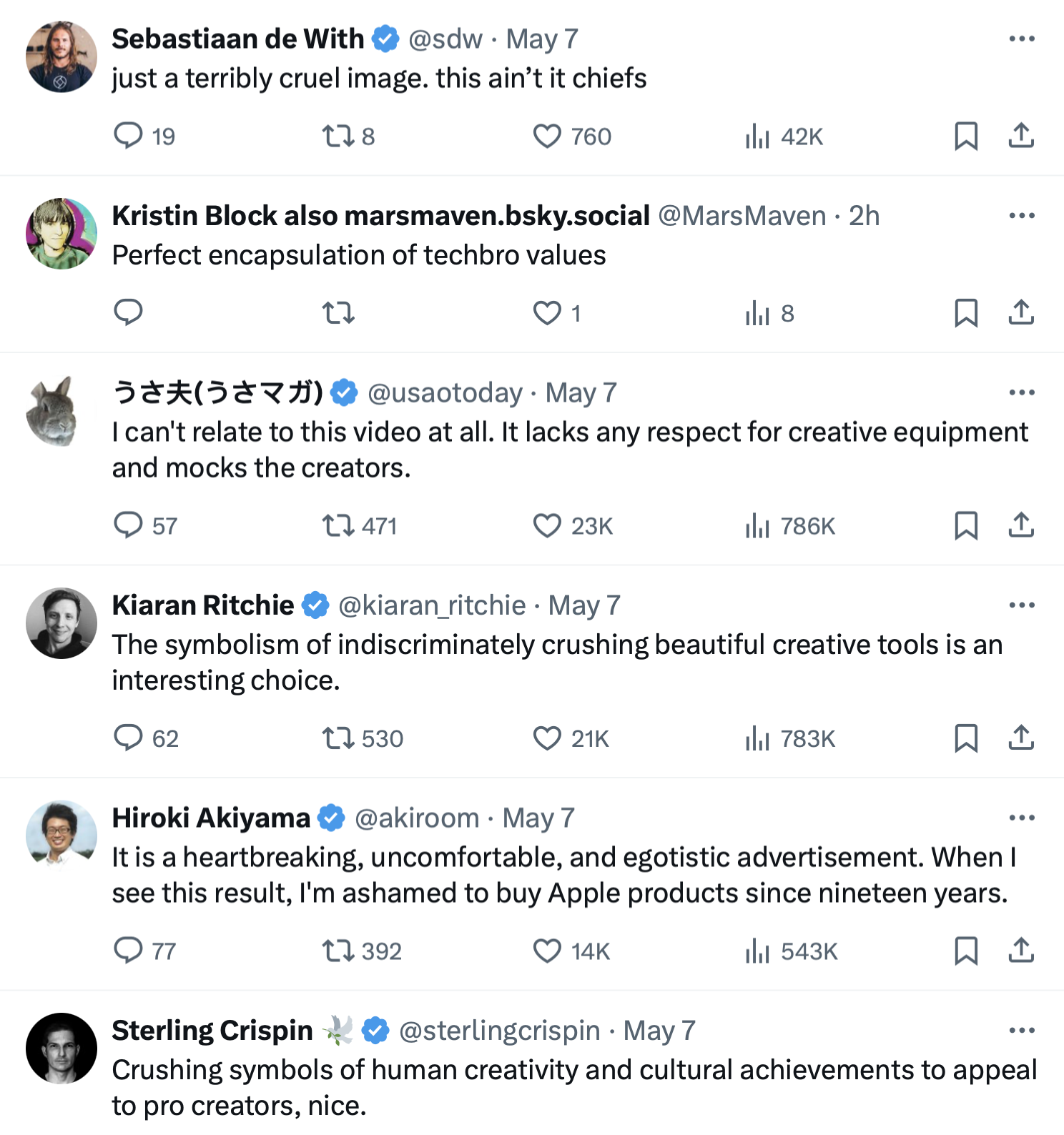
Yesterday, Tim Cook (forever Tim Apple to my mind) shared the ad for the new iPad Pro.
It went over like a lead balloon full of kittens in a hydraulic press.
Somehow Apple — one of the last tech cos people still like — managed to conceive, storyboard, create, and hit Publish on a new ad campaign that their top App Store developers & biggest fans called:
- cruel
- heartbreaking
- destructive
- wanton
- dystopian
- soul-crushing
Yikes.
Why is it so viscerally offensive to so many? How did this ever get made? What should they have done better?
And how can you — newbie, solopreneur, or small biz owner — ensure you never make the mistake a $2.82 trillion megacorp just did?
Let's talk about it.
Why is it so viscerally offensive?
I could easily spill a thousand words explicating the imagery in this video, but I think we can substitute with just a few still frames:
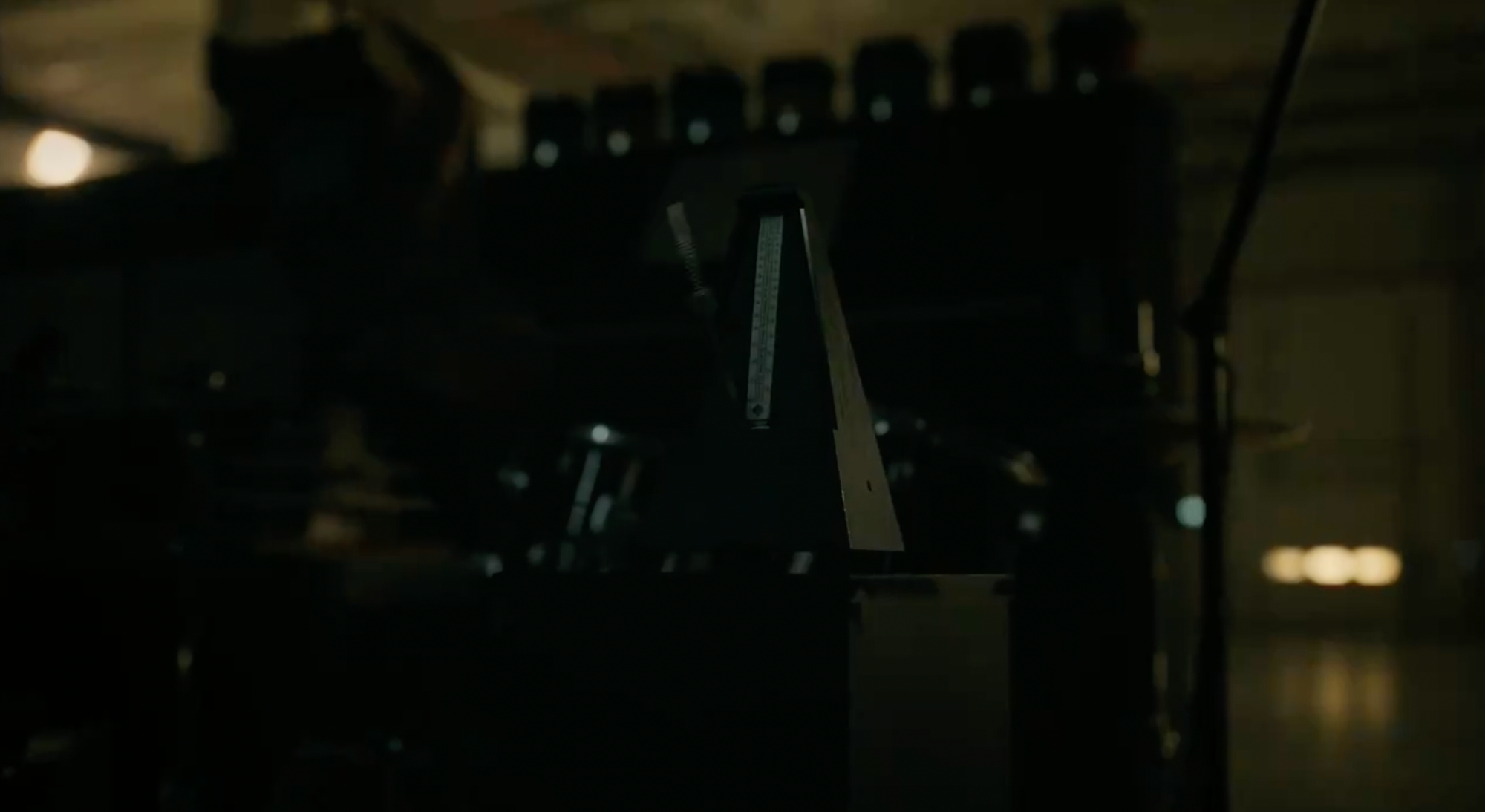

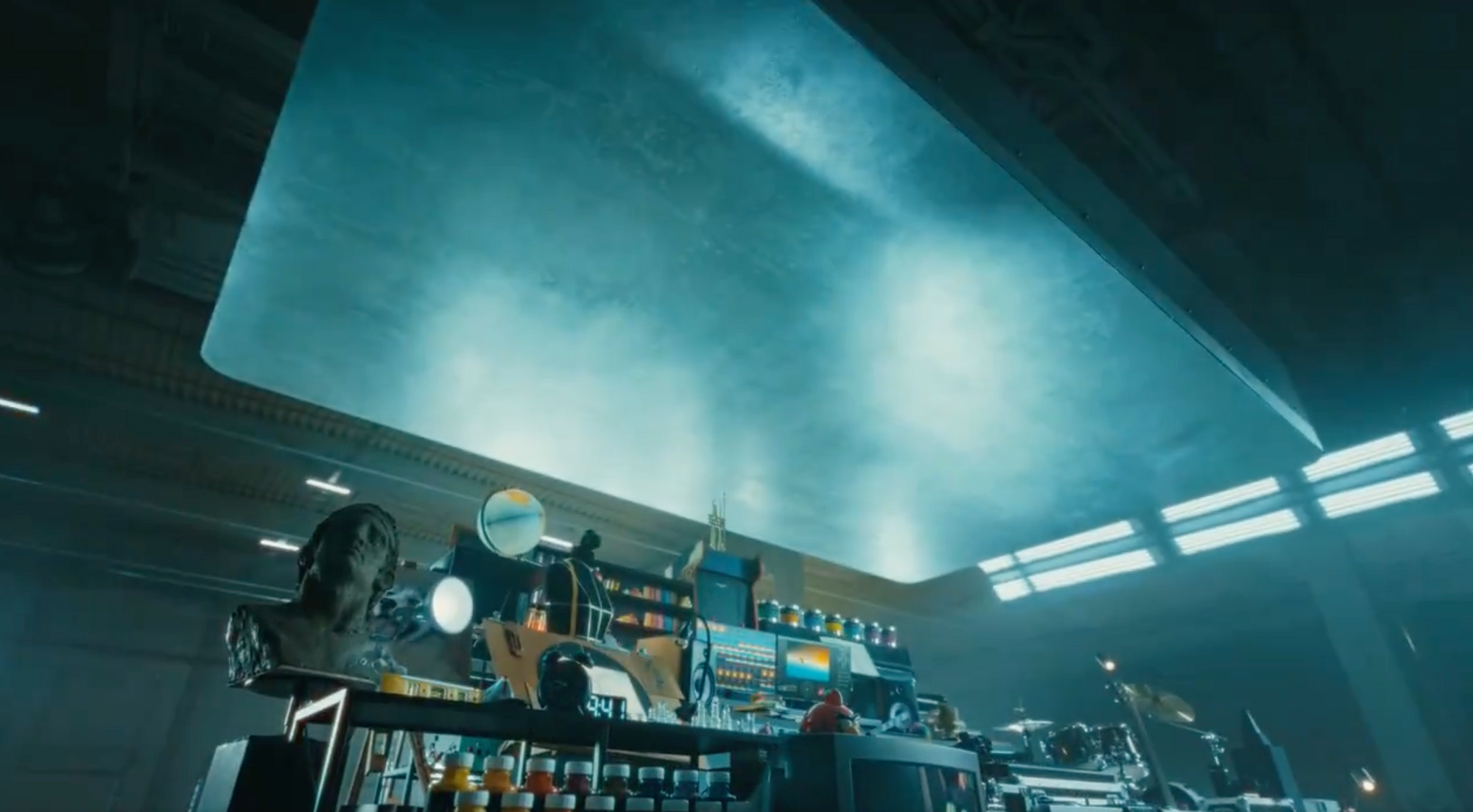
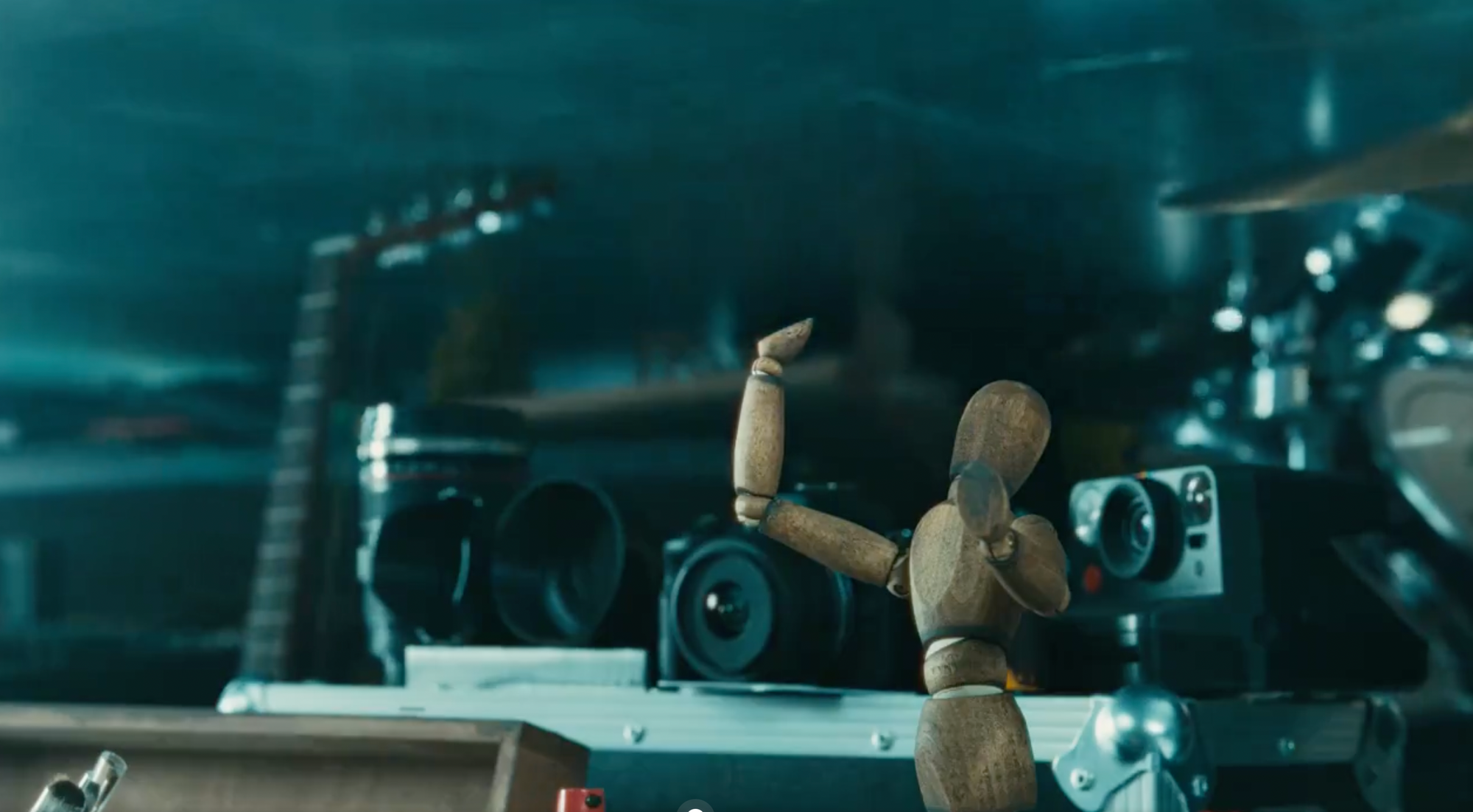

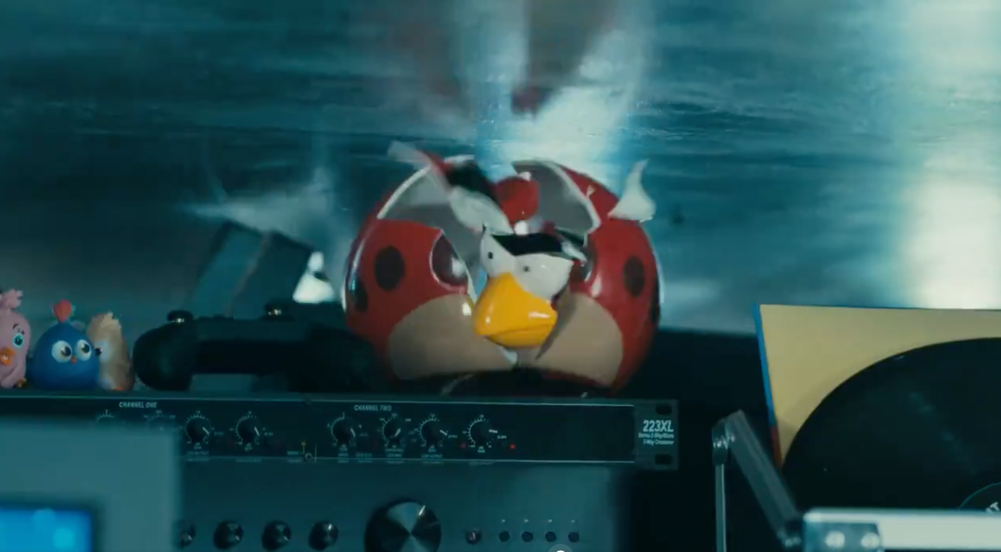
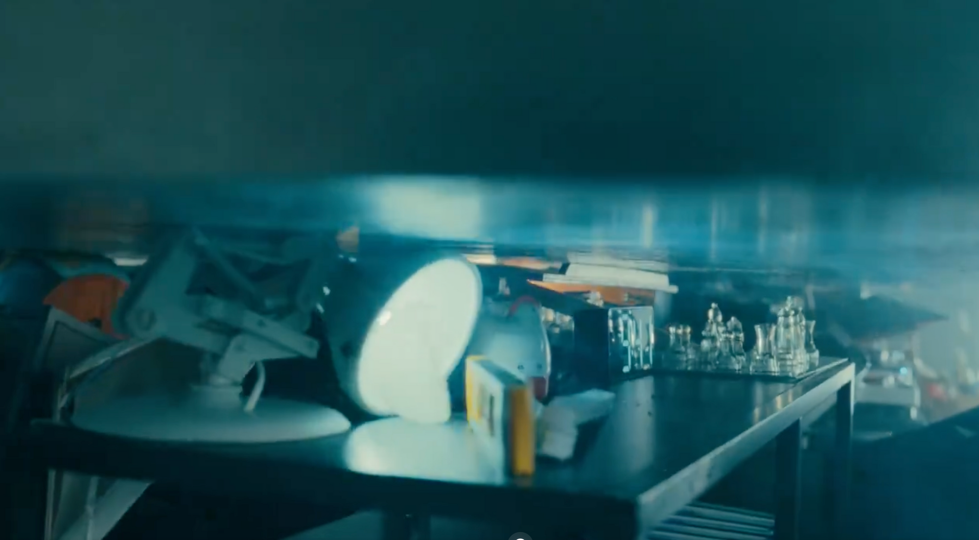
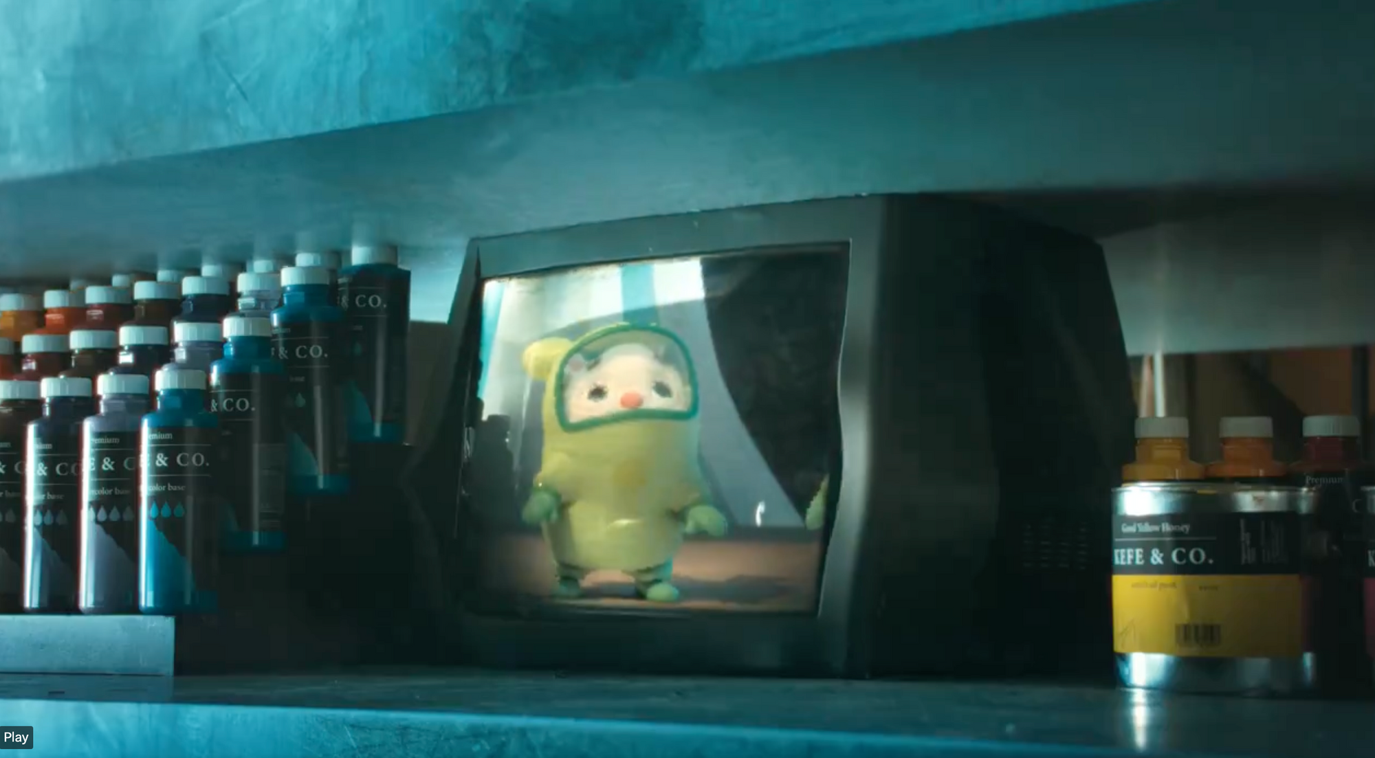
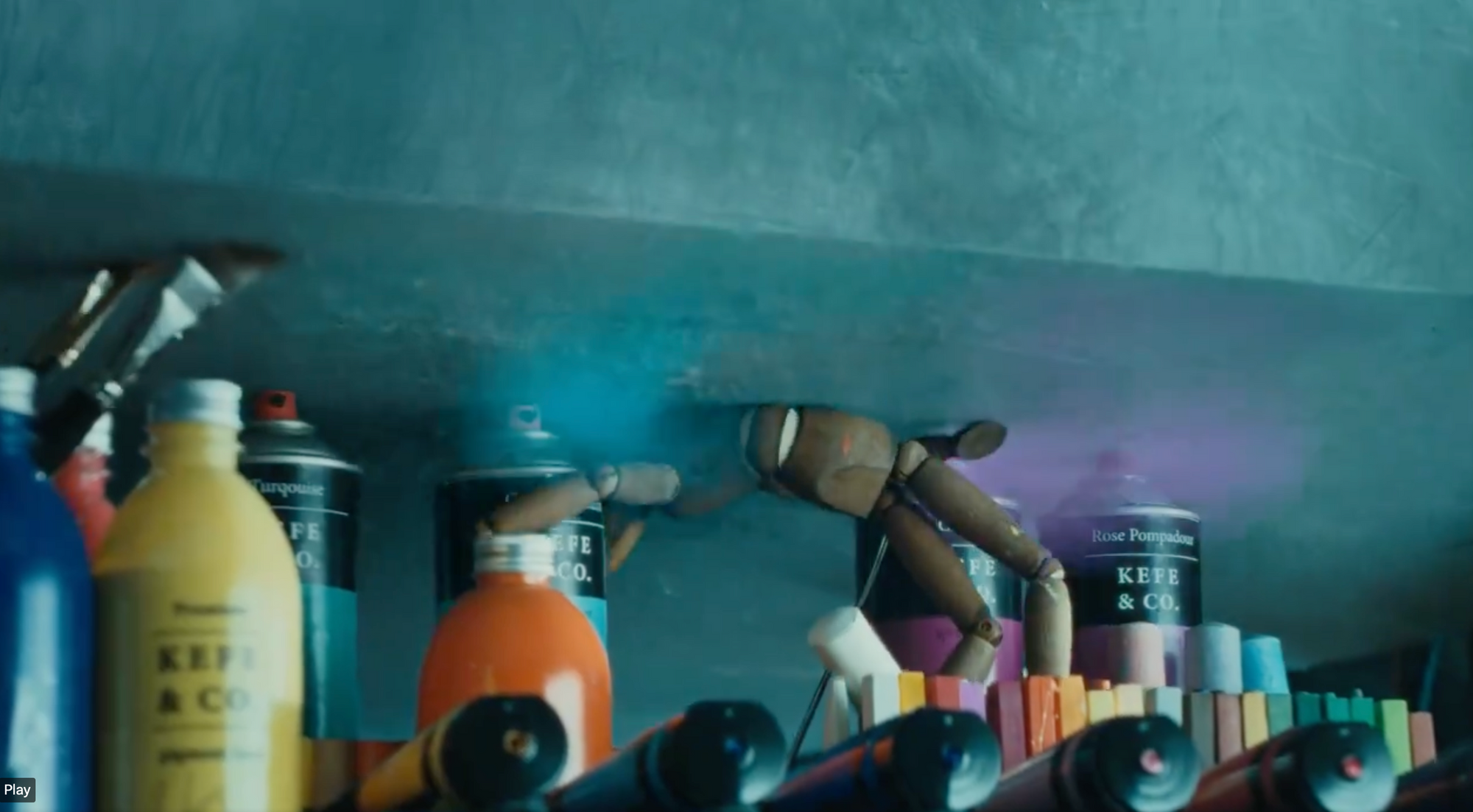

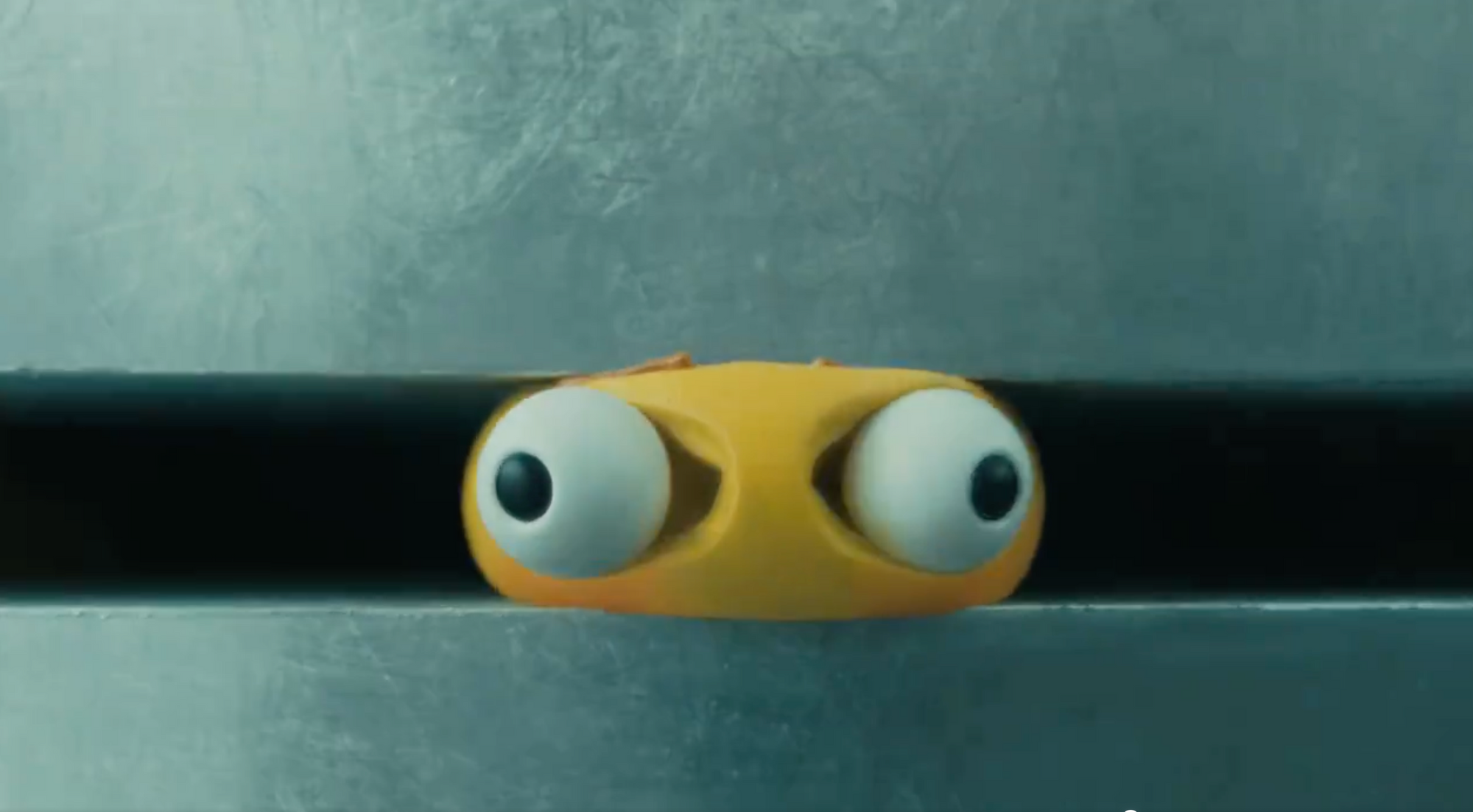
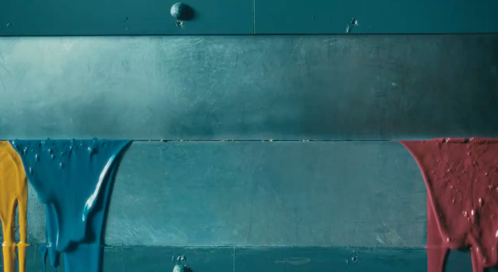

It's not as simple as, "they destroyed a piano and an arcade machine and paint and a guitar!" There have been destruction ads which were joyous and fun. Just think of the famous Will It Blend? series for Blendtec.
At every turn, Apple and their ad agency used the language of cinema to create despair.
They set the scene as dark, dystopian, and bleak… except for a pool of light, sound, and life which they then gleefully destroyed.
They positioned you, the viewer, in a vulnerable place, looking up at the machinery of destruction.
They took the things you love, use, made, learned on, grew up on… and crushed them.
They took a world of variety, light, sound, color, and life and took it all away in favor of a cold, glass rectangle.
They repeatedly used naked symbolism of human- and human-oid things suffering and dying.
The bug-eyed emoji and weeping paint was a final, potent fuck you.
It feels like punishment, because it is.
And right after that final sneer at the things we value, at humanity itself, they reveal… a fucking iPad??
They're done with their cool little art piece, you see… and so they expect the audience's emotions to be done, too. Because our emotions don't matter.
They expect us to flip instantly from agony to atavistic joy. Because they want us to.
This is what an abusive relationship feels like.
And that's why it's so offensive.
What went wrong?
It's very simple:
Nobody gave a single goddamn thought to their audience.
I've sat at the tables where decisionmakers and ad campaign people discussed "cool campaigns."
I've designed and implemented projects for Fortune 50 companies like Pepsico (who were a joy to work with because they listened, by the by).
I've even done work with TBWA/Chiat Day, the agency that created Apple's original 1984 ad — a dystopian setting from which the human stand-ins were freed as the climax.
These are not people who listen to their audience.
They are solipsistic navel-gazers in a hall of mirrors. They are out to please themselves first, and their peers second, their clients third, and if the ad campaign resonates with the audience, well, that's a nice bonus.
If they had ever paid attention to artists, creatives, musicians, designers, and hobbyists… they would've known better.
People who argue endlessly over the best paintbrushes, most resonant guitars, rarest arcade cabinets, so on and so forth, would never relish their destruction.
Artists love their tools (even when they hate them).
They do not want those things to go away.
They do not want software to eat their world.
They do not want all of human endeavor to exist only inside a flat, cold, glass reliquary.
They want tools like iPads in addition to their real-world tools and materials they can touch and feel and keep forever.
Literally anyone who spends any time with musicians, painters, sculptors, toy designers, retro arcade fans, etc., etc., would know this. Pop into any of their online forums for 1 hour and you would realize this. It wouldn't take much effort at all.
All these customer values are right there on the surface, baked into every interaction — every complaint, review, recommendation, brag, and story.
But, in an insular ad agency conference room, these customers don't exist.
What's "cool" and "innovative" is prized over what's resonant, meaningful, and effective. Because that's what wins awards, you see. (And non-monetizable human values don't exist to them at all.)
Ad agencies aren't actually in the business of selling products, they're in the business of securing awards. And clients. But mostly awards.
So, at every turn, I can assure you these folks were egging each other on about how "cool" and "edgy" and "subverting expectations" it all was. And that's exactly how we got the polar opposite of grace notes — fuck you notes, you might say — like the crushing of Luxo Jr, the crying critter on the TV, and the eyes literally popping out of the emoji toy.
And thus, the consumer backlash. Because… holy fucking shit, guys.
How can you ensure it never happens to your business?
It's easy: Respect and understand your customer.
No, really, it's that easy.
How? Sales Safari is the very best way to learn what your audience thinks, says, shares, loathes, what pains they have, and what they love above all else.
But really, just being a human being who listens would be enough to avoid a disaster like this one.